Enonic version: XP 6.7.0-RC5
OS: Windows
Hi,
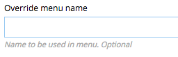
I just downloaded the 6.7.0-RC5 version to test my formbuilder app before finishing up the last parts before uploading new version. And then I saw the help-text fonts…
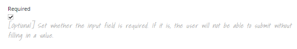
Rarely have I had such a strong reaction to a font (though there are exceptions). Just please, please, please change it! It is aweful. Just horrible. I struggle reading what is there, and it looks like a five year old played around with Word on Windows 95. You could have gone with WordArt and it would not have made a difference.
I somehow hope this is an internal joke, and you planned to change this before releasing the stable version 6.7.0, because I can not see any sane reason for leaving the sensible, clean and professional look of the rest of the site for this single, little feature. I think I noticed the look of it before, and I don’t know if it changed since early 6.7.0-SNAPSHOTs, but I kind of expected it to be changed by now…
Also, you might want to darken the font a little. The color contrast does not currently validate against WCAG 2.0. (Tested using Chrome Web Developer > Audits > Accessibility) Though there are multiple places with this problem, this particular feature, combined with the font makes it very difficult to read if you have anything less than a 20/20 eyesight.
My recommendation is to use the same font you use for regular text everywhere else in XP, and darken the color a little. It is okay to want to make it clear this is just a help-text, but do that with an icon or something else. Don’t make it less readable…
Finally: Sorry for venting on this, but I really feel that font deserves such a reaction…