We have been launching a new Enonic XP site and I have got this message from the content admins for the last week : “There must been something wrong. My created, modified, deleted content is not published”.
So for 90% of the cases the Publish button is not clicked.
Are there any plans for implementing:
“You have modified content. Do you want too publish the now ?” ( Notification on the top of the page)
“You have content with an error that must be fixed. View content with an error click here button” ( Notification on the top of the page)
It will probably help to have notifications like this, as long as they are non-intrusive. But in my view, the situation is a little more complex.
Ideally, the problem should be user tested in order to determine the reason why so many people don’t publish their content. Here are some hypotheses:
Is it simply due to forgetfulness? If so, then notifications are a good solution. An even better solution would be to improve the workflow, so that it becomes more natural for users to publish their changes, while it remains possible to escape with changes still saved for later.
Or does the problem reveal a fault in the interaction design? Maybe better button placement would help, or maybe content should be more clearly marked when it’s in an unpublished state? (my favorite suggestion)
Or worse: Is it a problem with the conceptual model, so that users don’t grasp the concept behind requiring modified content to be published for changes to be visible? This concept worked fairly well in Enonic CMS 4.x (with the exception of related content such as images, which people often forgot to approve, or they tried to publish the related content to the same page as the parent content). Thankfully, because users of Enonic CMS 4.x seemed to mostly grasp the concept, this shows us that we may perhaps only need adjustments to the interaction design, without needing a complete re-think of the core conceptual model.
I think the main problem is that its a little bit hard to see if you have changes or not. Users work with many changes and then forgets to publish the changes when they are done. Its a workflow you need to know about.
I think suggestion 2 with clearly marked changes and a notification icon on top left or right would do the trick.
On a similar note, there is a lot to gain by improving the usability of the toolbar where the publish button is located. Currently, the only thing that tells the user what each button does, is the label text on the button. Ideally, the user should be able to make a decent guess what each button does even without having read the actual label text.
How can one achieve this? Some methods include enforcing a consistent button order/placement, grouping buttons using separators, and providing contextual clues that provide extra meaning to the label text (icons, highlighting, etc.)
Currently, each toolbar button carries the same amount of significance/importance/weight. There is no hierarchy that determines which button performs the “default action”, which one performs “alternate action”, or which one performs “escape action”, etc. As a result, the Publish button gets no more significance than other less commonly used actions, for instance Duplicate or Delete. This could be one of many reasons why there is a tendency for people to ignore the Publish action after having made changes to a content.
I agree. A big, green button for publish would be nice. Also, delete could very well be made “less available” while editing. I have deleted content by accident multiple times.
mla, you’re touching on a possible solution to the problem, in the sense that the terms used as button labels do not match the concepts that the users make of them. Even if the Publish button were renamed to “Save and Publish”, there would still be users who conceptually think publishing is something that only needs to be done once, and that saving is when you approve your changes.
I think much of this confusion is due to users extending the concept of the save paradigm in MS Word: When saving a document in Word the first time, you decide where to make the document available. This is slightly comparable to publishing in Enonic. But in Word you’re never asked to provide a document location during any later save actions (unless you choose Save As…). And there’s autosaving to take care of saving drafts. Therefore, people don’t save their changes until they’re sufficiently happy with them. Saving changes in a document becomes the equivalent to approving them, and not just saving a draft copy. These usage patterns are very difficult to disrupt, and it’s much better usability if the interaction design makes use of these patterns instead of trying to force users into a new and unfamiliar usage pattern.
I suppose renaming the “Save” button to “Save draft” would clear up a lot of confusion. Then it would be more clear to the user that saving != approving the changes. There will then be a greater chance that users will start associating the Publish button with approving and making the changes go public.
There is a problem with my proposal above: Since the buttons are designed basically as nothing but text labels, they are only separated by whitespace. So if one of the buttons were to have two words like “Save draft”, that would make it more difficult to separate the buttons from each other because of the whitespace. So the button design will have to be reworked for this to be a viable option.
Also, this is a typical example of a problem where several ideas/prototypes should be User Tested, in order to better determine what works and what doesn’t.
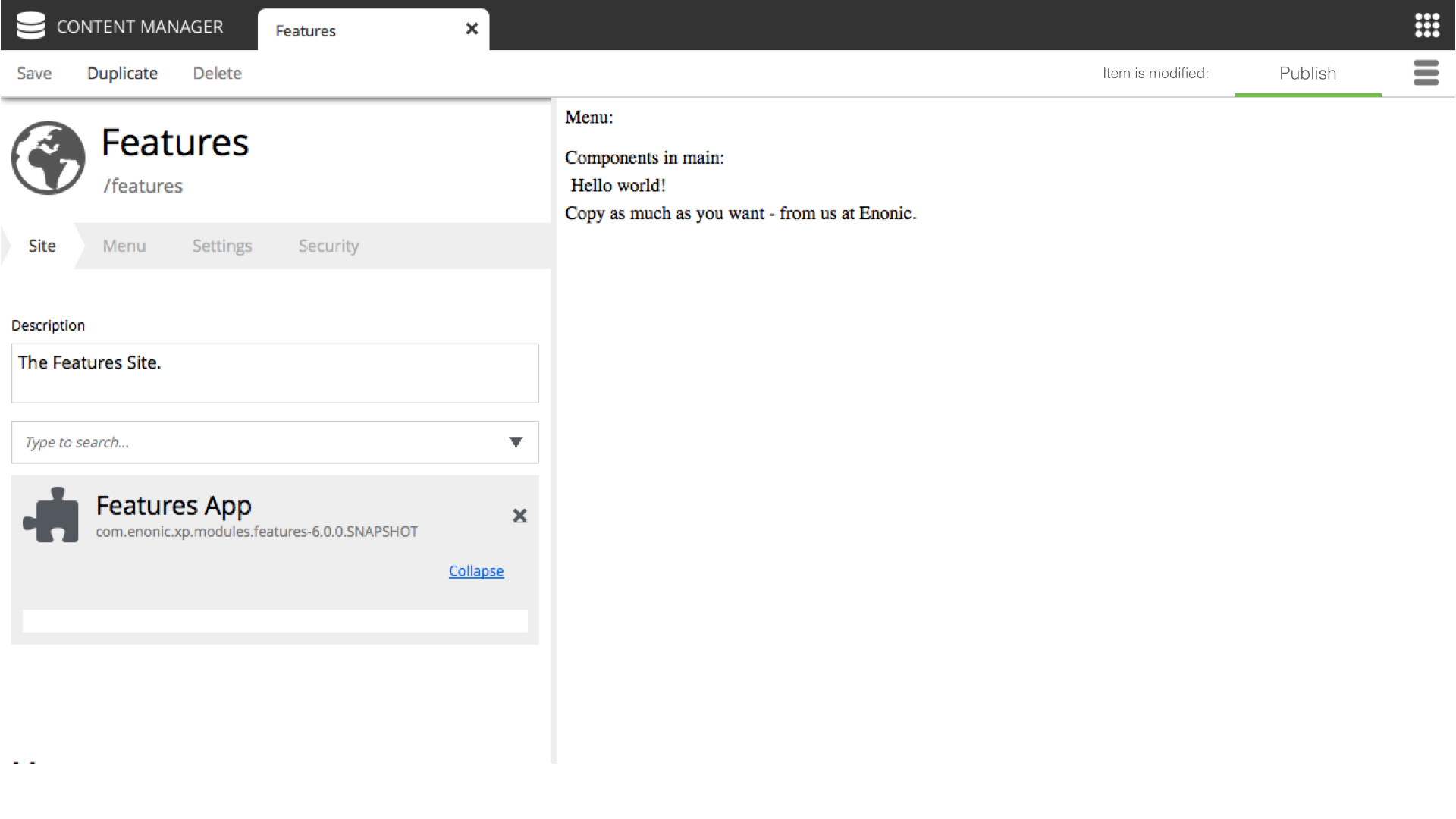
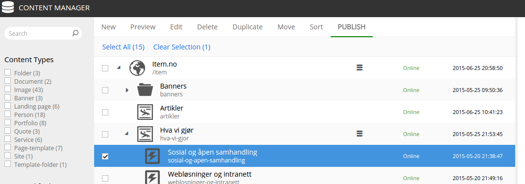
Hi, and thanks for great input. I assume the confusion is primarily related to the editing form - as this does not contain any status info, while the browse list does?
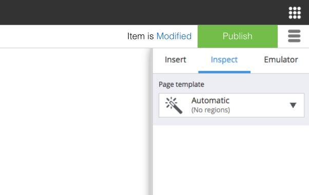
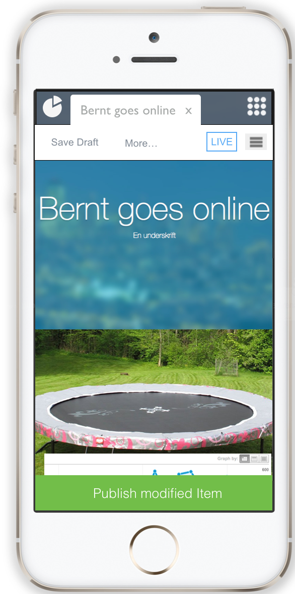
Below are some (very quick) ideas on how we could improve..
As status changes when editing, the green stripe could “fly in” to highlight the button. There will for sure be more choices here at one point - ala approve or other workflow steps, that’s the idea behind the dropdown.
With so much in Enonic XP being about WYSIWYG, I think it’s very important to make it clear to the users when What You See Is Not What You Get.
And to make things harder, we have the problem I discussed above with users’ conceptual model not matching the terms and usage patterns in Enonic. So when in one of the design mockups above the term “Item is modified” is used, this will make things easier for those who already understand the concepts in Enonic, but it will not make it easier for those who wrongly believe “saved/modified” means that the current visible changes are the ones being shown online. So some experimenting with different terms may be necessary. Hence my suggestion of using “Save draft” as a way of introducing the draft concept into users’ minds.
Anyway, I think what we’ve seen in the design mockups above, is a step in the right direction.
I think it is important that enonic show the underlying functionality. Its better to learn how it really is, even if it is a little bit more to learn, than to learn a consept that isnt really true.
Why not show with graphic or icons that you are now on a “new version” of the content, and that you can “merge” it into an already published content.