Hi team,
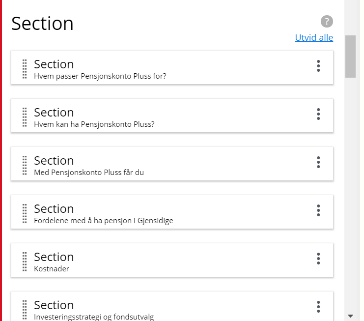
We have some users on XP 7.6 and they struggle a bit with how item-sets look in Content Studio. The “heavy-ness” of the name of the item-set for each item is the thing that annoys them. The heading is already Section, so we know this, then it is repeated inside every individual item in a style bigger than the actual title (the only information that is needed in their opinion). Looks the same in new CS3.3.
So we get “Section Section Thing that is very important Section Something else title Section ..” and so on. A lot of “Section”, and very little real valuable information. Could the name of the item-set be removed or at least made even smaller? It’s the title we’re looking for.
Guess this also goes for <option-sets>.